
INCLUDE-ID now has its visual identity. It will appear on this website, on the materials used in museums and schools, and on everything the consortium publishes until 2030.
People, inclusion, support
The symbol shows three figures, side by side, holding each other up. It carries the ideas at the heart of the project: people at the centre, inclusion and accessibility, culture and humanism, and technology as an enabling tool.
Chosen with children
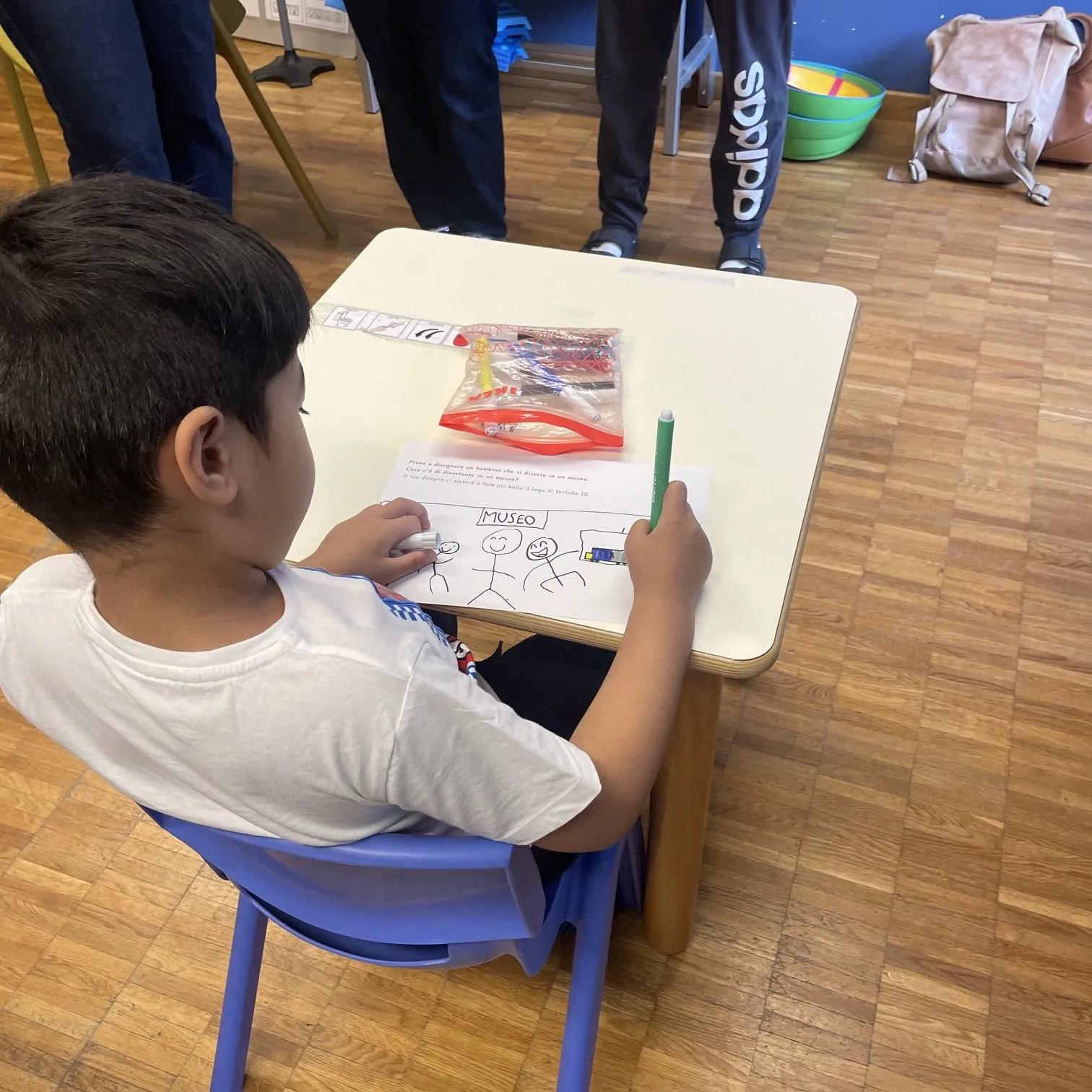
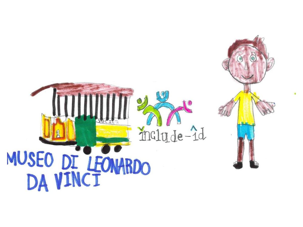
In the co-design workshop, children were asked to draw a child having fun in a museum. Looking at the logo proposals, they read the symbol as people together having fun. That reading was the reason this version was chosen.
Designed to be read by everyone
The four colours, Unity Cyan, Growth Green, Heart Pink and Sun Yellow, are always paired so that text stays readable. Texts use Inter at a generous size, never in capitals or italics, and key pages of the website are also available in Easy to read.
The identity was designed by Mirai Digital and is maintained by the Lisbon Council for the INCLUDE-ID consortium.